Death to Complexity
How we Simplified Advanced Search - A bit about the design process that went into reimagining Spokeo’s Advanced Search tools. This was a weeks-long collaboration between the design and front-end teams, with support from backend for some specific API updates.August 18, 2016 · Original articleThis article was edited by Sean D'Auria and originally published on Medium.
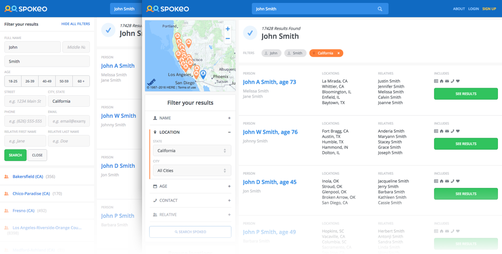
Considering the nature of people search, filtering by parameters other than first and last name is crucial. ‘John Smith’ doesn’t really help you find who you’re looking for, but a 36 year old John Smith in Pasadena, CA, related to a Susan is damn specific, and will inform you quickly if we have the data you want.
Hidden → Visible
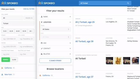
Our Advanced Search (AS) was hard to find. Small blue text beneath the map read ‘Show All Filters,’ which was an imperfect solution to the requirement that we maintain a list of clickable states (for SEO reasons), and that list be visible “above the fold”. The states are, in a sense, filters, but they are very specific and essentially a dead end without other filters.
We moved AS into a dedicated module which is always visible on desktop, and has a floating button on mobile. This provided obvious, persistent access to our most powerful search tool. Mobile search became a full-screen takeover, with the understanding that users would be in a binary situation: modifying query parameters, or browsing results. Supporting both on a small screen is futile.
Implicit → Explicit
We abandoned the expectation that users are experts. Anyone should be able to figure out how to use AS, even if it’s their first time visiting.
We added an explicit title that explains what AS does. An added benefit is that it provides additional visual differentiation for that section in the left panel.
We removed the behavior that would submit the form when users stopped typing, or tabbed/clicked to a new input. Now nothing changes until the user explicitly clicks “Search Spokeo” or hits Enter.
Clicking an age range used to toggle and submit immediately. No longer! Click ages on and off to your heart’s content before hitting that submit button.
Added bonus: the locations list got a title that explains its value.
Wall → Sections
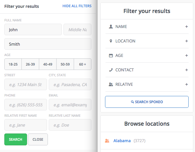
Opening the filters was overwhelming! Scanning the inputs was nearly impossible. Location inputs are directly related to each other, as are relative first/last name, but Phone and Email inputs were adjacent and independent.
Separating AS into logical sections fixed these problems and reduced the cognitive work for users. Each section can be considered independently, instead of the form appearing as a daunting task. Phone and Email suddenly make more sense in the context of “Contact info.”
Ambiguous → Guided
The City, State input was confusing because once a State was entered, users didn’t know they could edit it to enter a City, State combination. Users could also enter a City, State combo that returned zero results, leading to an empty state.
We changed these to native dropdowns, where the list of states only reflects states with results, and the city dropdown is only available once a state is chosen. The city dropdown also updates whenever a new state is chosen, and only provides available cities from the chosen state.
We removed the Street input, which required too-accurate, and often unavailable, information.
Cramped → Rows
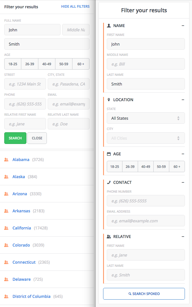
Street and City, State inputs were originally adjacent to follow the design pattern of the following inputs, not because those particular parameters should logically be side by side. In fact, for most forms (think shopping checkout) they’re most commonly placed on multiple lines. “Street” is also ambiguous, because we were actually expecting a full address, not just a street name.
Phone and Email being adjacent was a form-over-function design choice, which we sought to remedy. Relative first and last name kinda makes sense, but there’s no strong reason for it.
Now, each input gets its own row. Simple, effective, and visually less oppressive. All sections being simultaneously opened is an unlikely case, and ultimately the user’s decision. Fortunately, this flexible design allows this behavior without any negative consequences. We don’t make assumptions about how they will use Advanced Search.
Mobile behavior
A persistent problem we’ve had to deal with is maintaining crucial functionality in a left panel which disappears on mobile. Having the left panel is a hard product requirement, and we discovered an elegant solution to provide access to the Advanced Search panel on mobile.
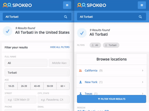
Previously, the Advanced Search panel was always open, and appeared before the results list. Users who didn't scroll down wouldn’t know that they could just browse, if they had no more information to provide.
By providing a floating button at the bottom of the page, we allow users to browse, and access filters at any point in their browsing experience. For example, if they scroll through 30 results and realize their search is futile, they can quickly access Advanced Search and refine their query.
General related cleanup
We added filter “chips” beneath the primary page title. These reflect the exact query that produce the results, and allow an easy way to remove any given parameter.
Our data shows that the map isn’t engaged with, but having it present is a strict product requirement. We reduced the size, providing more space for relevant content/tools.
The left panel width was flexible, with a hard minimum at 330px. Why ever allow it to take up more space, if everything fits and works at the smaller size? From now on it’s always narrow.
For SEO reasons, we must have a clickable list of locations. However, that list doesn’t have to be so prominent. We modified our React component to only show the first 10 locations, with an option for the user to ‘show more.’
On the horizon/what we’d like to do in the future
First and last name should not be required to search. Finding a person should be initiated with any available information (e.g. relative and phone number).
Allow entering a city without a state/
Mixed content list, where we can show name, address, social, phone, and historical records all in one list, with options to toggle returned types.