Reducing Visual Noise
...for a Better User Experience - A critical analysis of what caused confusion on Spokeo’s Person Profiles, and the changes we made to improve our most data-dense product page.October 21, 2016 · Original articleThis article was edited by Sean D'Auria and originally published on Medium.
Reduce icon overload
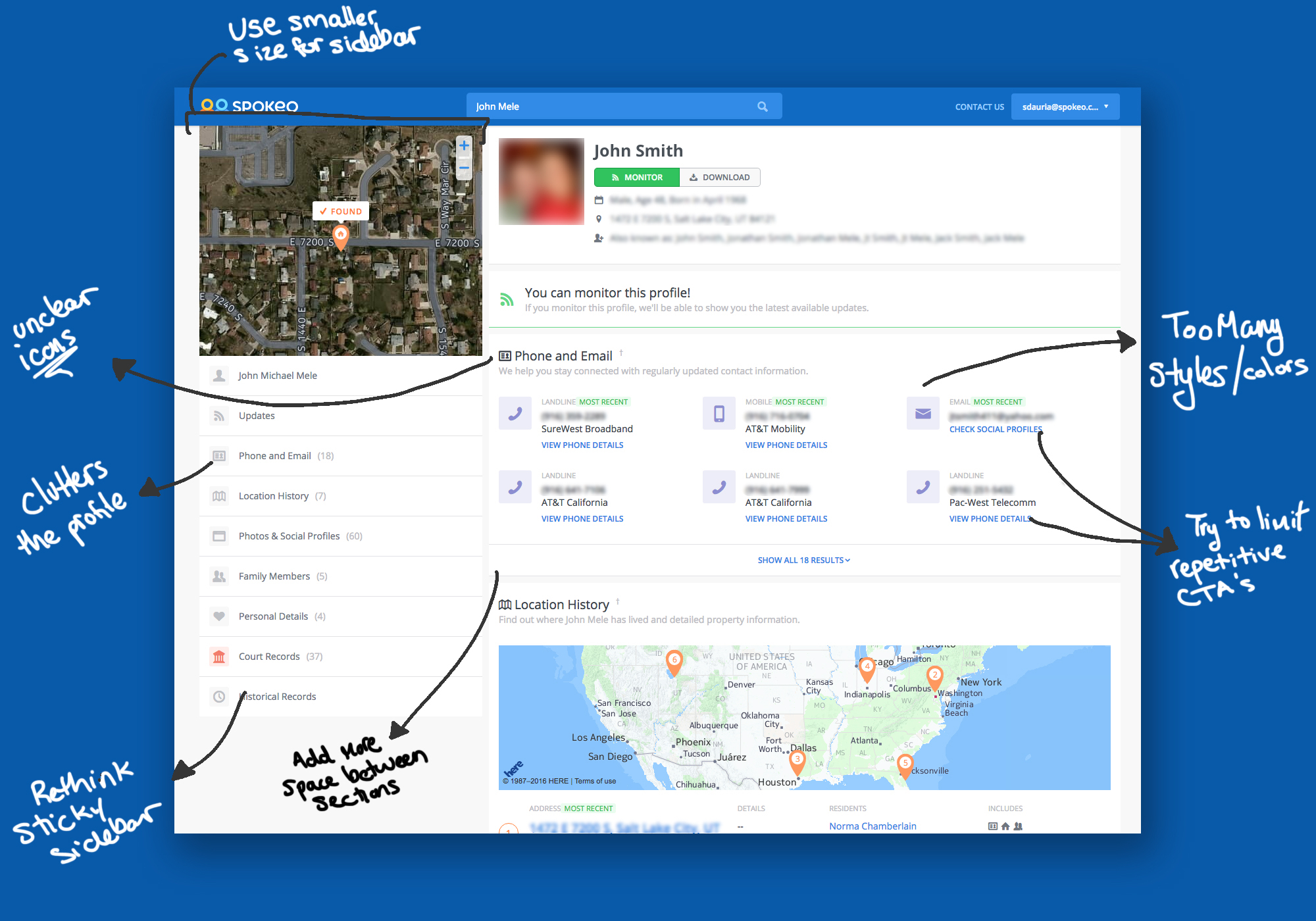
We understood that the Person Profile had become difficult to scan, but we weren’t sure why. As a people search platform, this is obviously an important page for Spokeo to get right. The page had gone through many iterations, as software should, and although no single change added an unreasonable amount of complexity, the cumulative result was that we were not conveying data quality and transparency as clearly as we had hoped. Noticing these problems as they occur is difficult, and teams should make time to review past projects for decay.
We took a look at Amazon’s product pages to determine how they are able to present so much content on a single product page while maintaining a reasonable amount of order and scannability. The largest takeaways from that analysis were:
- Each section looks different from the others (customer reviews are rows with stars, related products are image-heavy panels that flow to the right, etc)
- Section titles are big, simple text that visually break up the page, and are easy to read
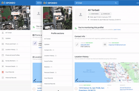
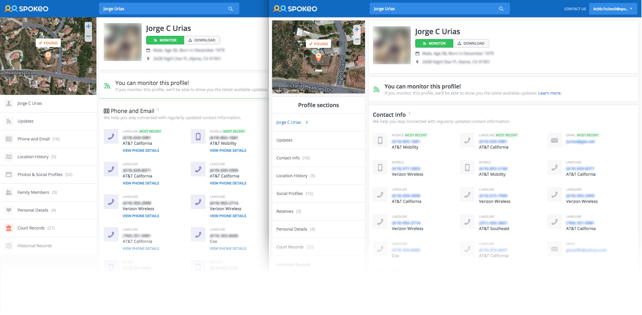
We had gotten a bit trigger-happy with our iconography. Each section had an icon next to the title, and the intention was that the icons would be easily identifiable. They would also indicate where new sections began, and make browsing the profile easier.
In reality the icons just added visual complexity without improving readability or breaking up sections. In fact, the icons made differentiating between titles and content even harder. Deciphering the icons required extra cognitive work. We removed icons from section titles and page navigation, and updated the titles to better explain the content within.
Sell value, not features
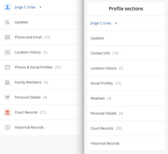
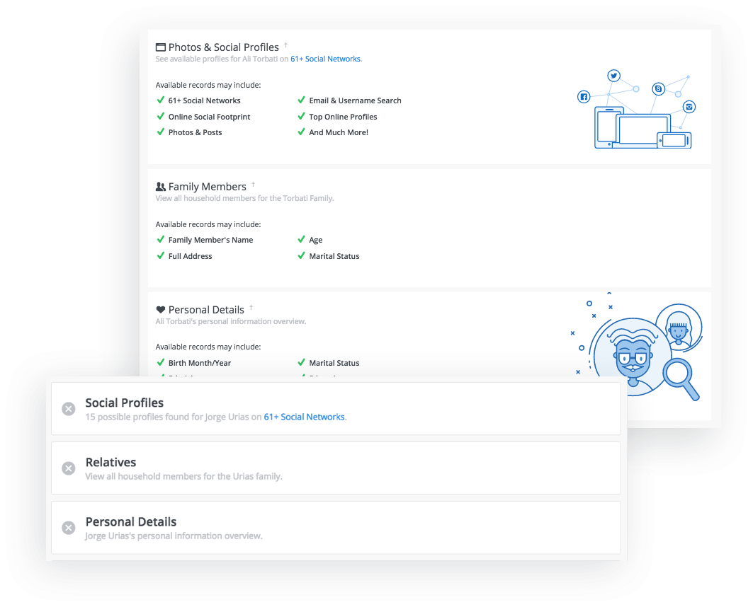
Our section titles were too literal, and just conveyed the information we provide, not why that information is useful, or how to use it. “Phones and Emails” became “Contact Info,” illustrating to the user that this information has value because it provides a way to get in touch with the person in question. We’ve added value for users without drastically changing the product.
Similarly, the title “Photos & Social Profiles” was basically satisfying marketing/SEO needs without considering users. Nobody thinks or speaks like that, so why should we? Google may find the word “Photos” on our site, and that may affect our ranking in some minuscule way, but we should focus on providing the best product we can with the understanding that user actions speak louder than optimistic copy. If we can reduce our bounce rate, and if people find what they want, they’ll probably stick around a little longer and improve our Google rank. Anyway, the section essentially shows links to social profiles, so we explain that directly. No need for extra words cluttering an already text-heavy UI.
Be deliberate about color
Users don’t understand your color scheme. At best they understand that colors indicate relationships, and at worst they are confused about the patterns they suspect but can’t discern.
Over the course of many iterations we tried to tie certain colors to certain data types (e.g. Location info was orange, and Contact info was purple), but that never really caught on and we ended up informally abandoning it. The result was that some sections of the profile had vestigial color-coded elements, but they were meaningless without the greater context in which they were conceived. We removed these colors, avoiding any potential misunderstanding based on a now-non-existent color system.
We removed color where it wasn’t being used to convey functionality or specific meaning. All “icon jewels” became gray. Unnecessary blue CTAs under Contact info were deleted, and the primary text became clickable. Empty sections (“No Results cases”) no longer had colorful images demanding users’ attention. The whole page became simpler, lighter, and easier to digest.
Revamp your advanced filters
I wrote an entire article about this: Death to Complexity: How we Simplified Advanced Search
Actually design mobile first
We had been struggling with a five-column, stacking-on-mobile, row pattern for months. The design originated on desktop, and had been massaged and wrangled to kinda work on mobile. Even so, a single row took up the majority of a mobile screen.
Since the multicolumn design converts well, project stakeholders are generally hesitant to change it. As a compromise, we limited the number of columns to never be more than four, and we did a major code refactor that made maintenance easier (Comment if you’re interested and I‘ll write more about the refactor). To be fair, this still isn’t mobile first, but it’s better than it was. We’re working on a truly mobile first solution right now, and will start testing it soon.
Don’t stick elements willy nilly
Our sticky panels were a constant headache. Implemented on one page they might have been possible to maintain, but the simple reality was that they had to handle too many unknowns, and responsive behavior added a whole additional layer of complexity. On top of all that, they didn’t really add to the user experience. If anything they allowed us to be sloppy in choosing what to put in each panel because we could expect it to just stick around if it grew past the viewport height.
The new sticky panel is essentially a more intentional, restrictive implementation of what the original sticky panel should have been. Since only the last panel can be fixed in place, it forces us to be intentional about what we put there. It also allows us to hide the map, which is a visually oppressive, functionally useless element we are required to keep for business reasons.
Design for the worst, hope for the best
Our subpanel was about 430px at the widest screen size, but could flex to as small as 330px for smaller screens. If everything had to work at the narrow size, why did we ever allow it to take more space than it needed? Our subpanel went from about 1/3 of our page to about 1/4. Limiting the width provided more space for the primary content, and solidifies users’ understanding that the subpanel presents secondary information.
Limit feature dependencies
Putting borders on each panel allowed us to think of them as independent entities, so functionality was scoped and we were better able to rearrange or add/remove panels. Code-wise it dictated that behavior in each panel was self-contained and relatively decoupled. Creating artificial restrictions such as these force designers and developers to think more critically about how they want to implement features. Obviously we could remove this restriction, but our product development process would look like the wild west. We create constraints because they make our design stronger, not because we like to make arbitrary rules.
This project was largely inspired by Tobias van Schneider’s Broken Windows article. It put into words what our design team had been feeling for a long time, and helped us take the first step towards cleaning up our aesthetics, and hopefully our products as a whole.
H/T to Sean D'Auria for being a design and research partner on this project (and others), and helping create and assemble assets for the article.