Heirs Entertainment
Portfolio site representing and elevating black-owned mixed mediaAugust 1, 2020 · View siteIntro
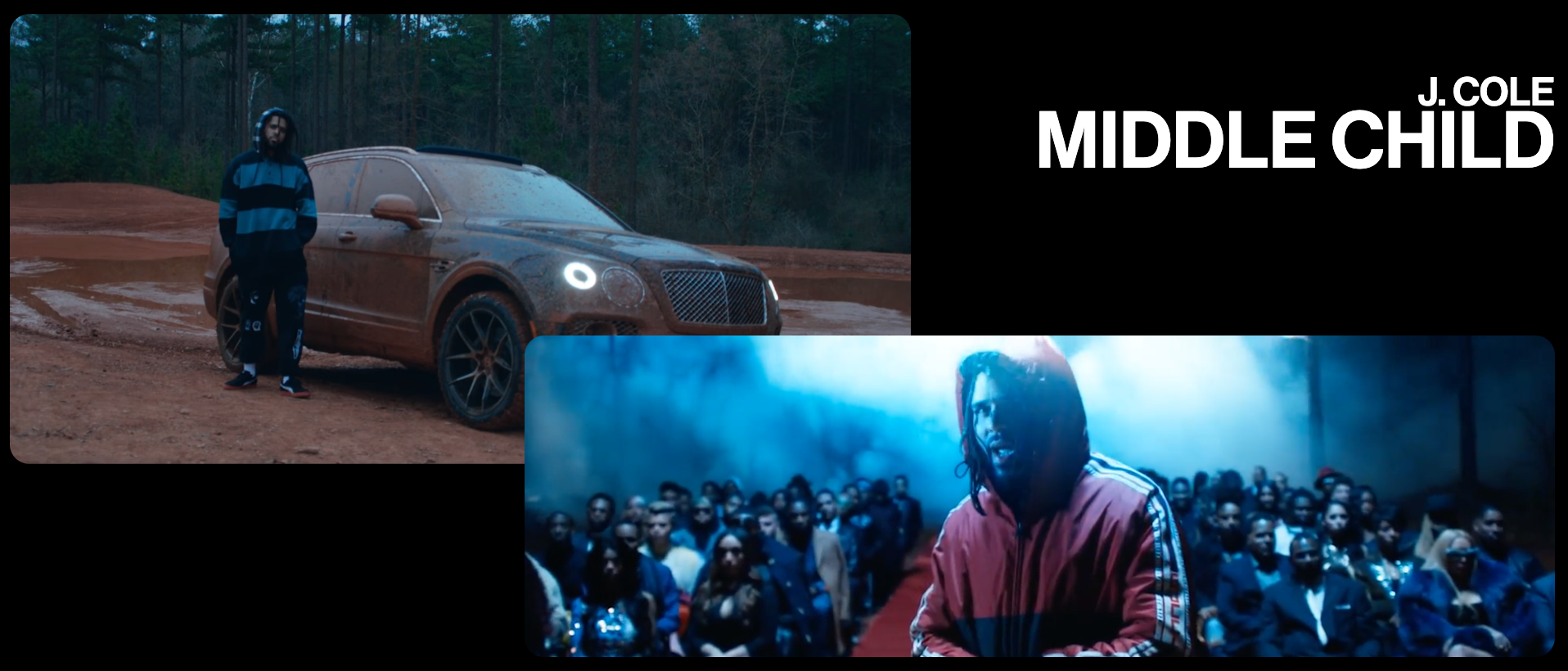
The incredibly talented team at HEIRS Entertainment got in touch about designing and building a site that did their work justice. They have produced music and videos for Mez, J. Cole, Isaiah Rashad, SiR, and more, as well as high profile projects for Netflix, Nike, and Puma.
They needed something built from scratch, quickly, and without compromising on their signature style. We were tasked with bringing their work online in a way that's true to the HEIRS philosophy. Our team (myself, Zeke Wattles, and Alicia Rangel) got to work.
Challenges
Throughout the project we encountered several constructive challenges. The creative input from the HEIRS team pushed us to think creatively about how to solve uncommon problems. As a result, we produced some unique interactions and strong identifying characteristics for the site.
Boomerang previews
The first big challenge was the boomerang-style videos. The clients were insistent that when hovered, the video previews should a) play sound, and b) boomerang. This posed an immediate issue - playing audio forwards and backwards would sound awful. If we were to hover the video and play a few seconds forward then a few seconds backward, we were sure the result would be unsatisfactory and not up to either party's standards.
After giving it some thought, we had a breakthrough: By decoupling the video and audio, we could play the video forwards and backwards while letting the audio track play straight through. Another benefit of this approach was that it allowed us to arbitrarily pick the best independent audio and video snippets for the preview, even if they didn't happen to coincide in the actual published work.
As is often the case, our breakthrough seems obvious in hindsight. But at the time it was well-received as a clever solution to the problem, and it holds up.
Polygon video mask

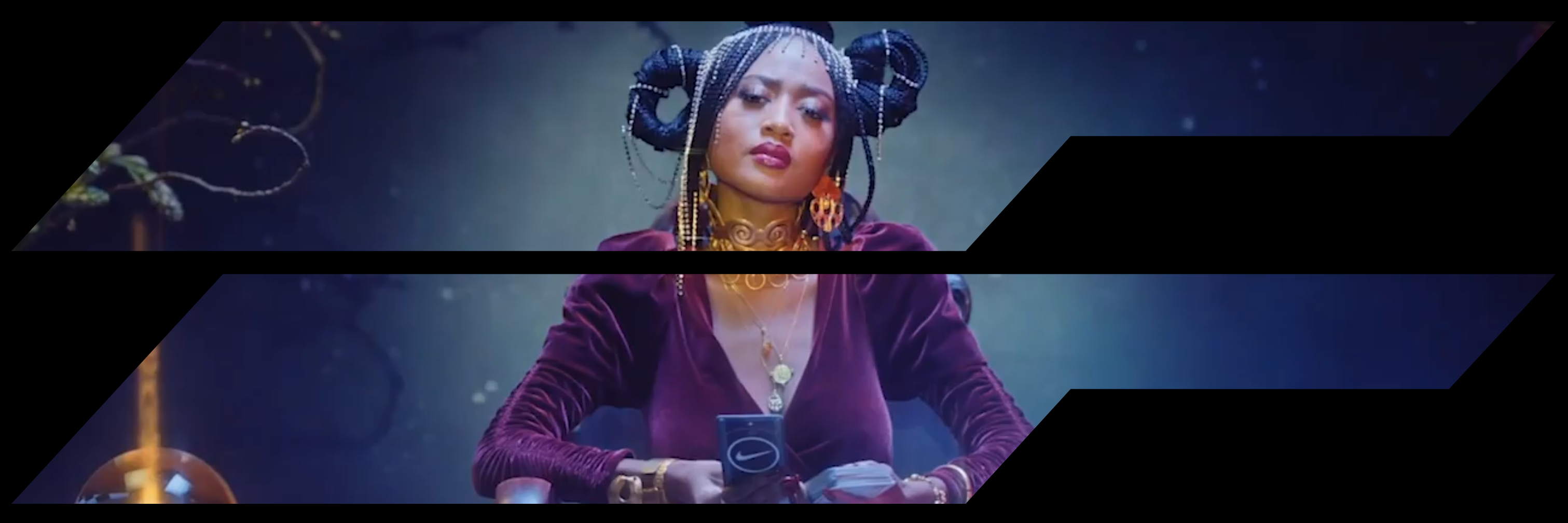
The second major challenge was more technical than conceptual. The clients wanted a branded shape to frame each project preview, but the "grain of the web" doesn't easily allow for non-rectangular polygons to mask videos. Of course we could have edited the video preview sources to include the shapes, but that would have made future updates more cumbersome and possibly inconsistent. Also, if the masked shape was included in the video source instead of the code, we would be super tied-in to this design direction in the future.
Our solution was to use the CSS property clip-path to reference an SVG embedded in the webpage. The SVG included the desired shape, and we use that shape to mask videos. In the future if we want to change that shape or remove it entirely, we will be able to do so with minimal code changes and no further video editing.
Version 2.0

More recently we were contacted again to refresh the look and feed of the HEIRS site; to make it feel more modern and fresh.

We made a few significant tweaks that improved the overall experience and really elevated the site:
- Added a Directors page
- Refreshed typographic system (mobile + web)
- Optimized mobile web
- Refreshed landing page (w/ new reel)
- Refreshed nav (more commerical/standard/horizontal)
- New layouts on work and directors pages
- Elegant hover motion effects on the work and directors pages
- Attention to detail like mobile behavior
We also took on a major rewrite of the application to bring it up to modern web development standards:
- We moved you from static HTML to a modern build infrastructure (Next.js)
- SEO-optimized to show up in search results
- Included metadata so when the link is shared online or in messages people see a preview image
- Used server-side rendering, meaning it loads fast for users, and is cached by web crawlers like Google
- The site works without JavaScript, which means Google will give it a higher quality ranking